Design Guidelines with Tailwind
How our designers and developers use Tailwind for quicker results
It’s hard getting design to markup done right. It took us some good many years to reach the point we are now. It’s not just about good design, or good markup skills. It’s more about making sure that from the get go, there’s a strong link between the design, and the final HTML output. That link should start from the color palette level, through typography, and all the way to a full fledged responsive design.
Tailwind (a.k.a. TW) is a popular CSS framework that allows theming any site with any design. It has been a key part in our design and development for some time. In this post I’ll share some guidelines and workflows we’ve been applying successfully, while working with our internal design team. I hope and believe it can be used by others as well, even for developers or agencies that don’t have the privilege of in-house designers.
Alright, enough for the intro, let’s jump right into the technical details, which helped our developers and designers not dread the day of designs handover.
Colors
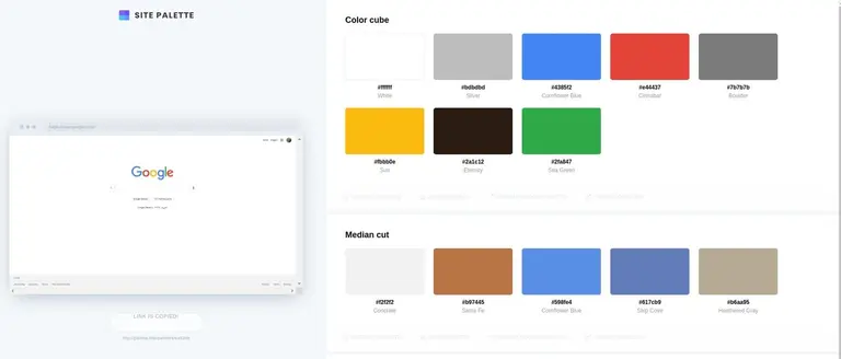
Colors are an important factor of every design, and there isn’t really a mathematical way of getting the right colors. However, there are some helper tools. So either our designers start from some color palette that they have decided on using their illusive design skill that somehow allows them to do it, or if we upgrade an existing site - which we need to keep the brand colors - we can use this Chrome extension that helps them extract the major colors. See an example of such a palette.
Either way, we start with a small palette with the basic colors.
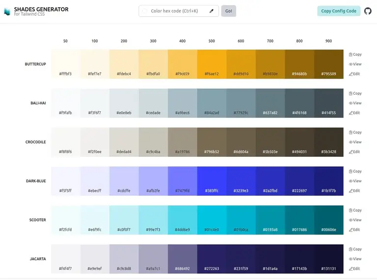
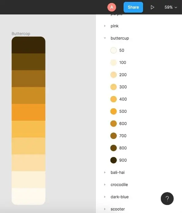
Next step is using a tool such as this shade generator that auto-create shades along with TW config. The result is obviously just a serving suggestion we get from some nice algorithm - it’s surely not going to be the final palette. Still, it saves time, and gets right a big part of the shades.
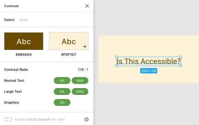
Designers are still expected to adjust the shades using their “design eye”, in order to create a nice scale for each color. One neat trick we are using to check that we have reached a balanced scale is having an 800 shade text over a 100 shade background of the same color. If the contrast is accessible then it’s a good indicator that the color is “spread” nicely. But again, make sure it looks right - don’t rely only on auto-generated colors.
After that we import the color styles in Figma, so when our developers inspect the design they can easily know which color should be applied, by its name - saving the time of looking over long files with hex color values.
Measurement Units
Unlike design tools such as Figma or Sketch, Tailwind uses rem values instead
of px which is the recommended way for building modern sites. Here’s a
calculator to assist with any needed
conversion and here’s a cheat sheet.
In any case, it isn’t too hard: 1rem = 16px.
Font Size
Here are the predefined font sizes. We can add new ones as well, the only guideline here would be not to add too many styles. That is, it’s enough to have 12px, 14px, and 16px - and it’s better to avoid adding 13px or 15px, as it’s hardly noticeable and considered as excessive styling. We call it “over-designed”, and it’s the development equivalent to “premature-optimization”.
Spacing
Spacing refers to margins and paddings. Here are all the pre-configured values. As with any other config, we are able to add new values - but it’s important not to overdo it with almost identical values (e.g. a margin of 20px vs 21px).
Similar to the rest of TW’s config, values are defined in rem. A quick way to
convert those predefined values from a name to the actual pixels you’d need to
design with is by multiplying by 4.
So for example:
m-1(mstands for margin) is translated to a margin with 4 pixelsm-1.5is 6 pixelsm-4is 16 pixels
Breakpoints, Containers and Padding
Tailwind pre-defines some standard breakpoints used for responsive design. More often than not our widest container size is 1280px, which is similar to the one provided also by Bootstrap, and is a safe value to follow.
The padding on left and right is obviously configurable, but it’s pretty common to have 4px on each side on mobile, and 20px on bigger devices. Your mileage may vary, but I’m sticking here to the “safe” values.
One special container to consider is for “Prose”, that is - a piece of text, and some
media such as blog post where we’d like to optimize the reading experience of the
user. An industry standard is defined as max-width: 65ch; which roughly means
“up to 65 characters per line” (it may be slightly different depending on the used
fonts). In fact this post you are reading right now, is inside such a Prose
container.
Icons
Font-awesome is a common one, and pretty much the standard. heroicons made by the Tailwind folks, is also quite handy, although limited in what it has to offer, but worth checking. In any case there is really not much of a limitation here. If we don’t find any matching icon, we’ll use Figma to create it - which in the end is just some SVG.

Amitai Burstein
@amitaibu