Walking the Tightrope without a Net: Prototyping in Browser with CSS Grid
My experiment in CSS-Grid, stepping outside my comfort zone, and relying on the the knowledge of others.
Not long ago, I was reviewing some ideas with a client about his homepage. It was a pretty typical issue – some dynamic content (in this case, educational resources) that needed to be arranged and highlighted in different ways in order to draw in users. There are a lot of known patterns to use here some of which would work well. I had a few ideas – none of them particularly earth-shattering – that might solve the problem.
So what’s the next step?
I could have gone to a designer, translated the idea, waited for PSDs to come back, shared with the client, and rinsed and repeated. A totally valid and worthwhile process in cases where a designer’s creative treatment is needed. But in this simple (and low-budget) scenario, there were some clear tropes that could be used. Of course, there are prototype apps like InVision or Axure, but I haven’t really found the case where fumbling through these tools myself was worth the learning curve. Here’s where CSS-Grid settled into the process really nicely.
Because I had been following the CSS-Grid Specification quite closely – mainly through the Twitter feeds of leading advocates and members of the CSS Working Group like Jen Simmons and Rachel Andrew (more on the importance of that below) – I was eager to try it out in this context.
Skipping the Sketch
I’ve long been a proponent of prototyping in browser. Mostly because I’m pretty bad with a pencil and paper – but also because it’s become a realistic way to present ideas on an actual screen. CSS Frameworks like Bootstrap and Semantic UI, of course, make this a a lot easier by providing defaults, re-usable elements (like buttons and tabs), and most-importantly a grid upon which to lay out content.
But there are at least two constraints in this method:
- All of your prototypes end up looking like a typical Bootstrap or Semantic UI website. Not that there’s anything wrong with that, but defaults generally get you to a default position.
- The grid – that we so desperately need – forces itself upon the content. In order to get layout for your content, your markup needs to contain the framework selectors to indicate the layout (you know,
col-md-3andui four column grid).
That’s where CSS-Grid is really great: all layout stays in the CSS and all content is just content. Much ado has been made about “source-order independence,”" which indeed is cool. You can move things around on the page independent of how it appears in the markup. But the overall separation of content and layout is much more fundamental to what makes it a great tool. It’s content agnostic in that it really doesn’t care what your content looks like. As long as there is some structure to it, you should be able to lay it out how you want.
Another really cool thing about using CSS-Grid in a prototyping task like this is that you can inject it directly into the situation that you need. Working independent of a framework, you’re not burdened by any of the defaults of a particular framework. I can literally create a bit of layout on demand in just the space I need it and disregard everything else.
Drawing the Canvas
Back to the client: I promised that I would get back to him the next day, so I didn’t have a ton of time. Encouraged by enthusiastic advocates for CSS-Grid, and strengthened by their shared knowledge, I got to work.
First, I just grabbed a static version of the homepage (yep, just by copy/pasting the source code along with the compiled CSS and JavaScript and crudely put it in its own include in a static site). At Gizra we use our own Jekyll Base to do static sites, so it makes slicing up a template pretty trivial. Basically everything above my highlighted block was the header and everything below it was the footer, and it allowed me to treat the area that I was working on as the page content. It worked out so well it felt like cheating.
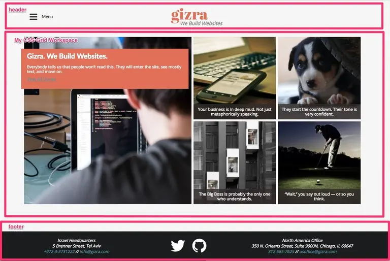
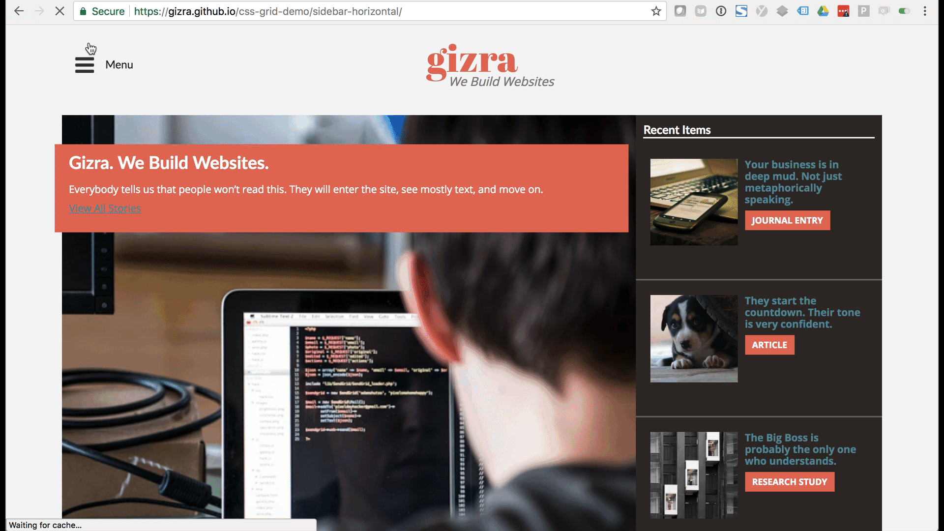
The next step was to create my content area. I tried to give it a basic structure that contained all of the elements I wanted: A list of items with a title (one of them “featured” with a subtitle as well), an image, a category “tag” and a hover text. That’s it, and it looked something like this:
<div class="resource-container">
  <div class="item item-title">
    <h3 class="resource-title">Recent Items</h3>
  </div>

  <!-- This is the featured item -->
  <div class="item item-1">
    <img src="https://placeimg.com/690/690/any">
    <div class="featured-resource-title-banner">
      <div class="featured-resource-title">
        <h2>Gizra. We Build Websites.</h2>
        <div class="subtitle">
          Everybody tells us that people won’t read this.
          They will enter the site, see mostly text, and move on.
        </div>
        <a class="subtitle-link" href="">View All Stories</a>
      </div>
    </div>
  </div>

  <!-- This is a regular item -->
  <div class="item item-2">
    <img src="https://placeimg.com/280/280/any">
    <div class="resource-title-banner">
      <div class="resource-title">
        Your business is in deep mud. Not just metaphorically speaking.
      </div>
    </div>
    <div class="resource-type">
      <span class="resource-type-title">Journal Entry</span>
    </div>
    <div class="teaser-hover">
      <div class="teaser-hover-text">Read Now</div>
    </div>
  </div>

 <!-- more items... -->

</div>
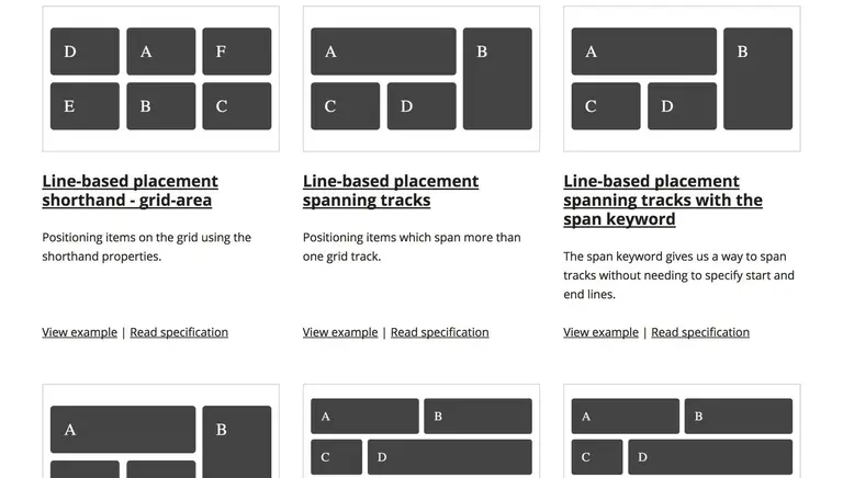
Next was the new part for me – to create the layouts that I had in mind, I needed to dive in and play around with CSS-Grid. In short, it was surprisingly easy. I challenged myself to make as many layouts as I could without touching the HTML markup at all. In the end, I exhausted my allotted time long before I ran out of layout options. In each of the layouts in this demo (which uses the Gizra website in place as an example) the only difference in the markup is the CSS selector on the grid container itself.
If you want to try this at home, you can use the CSS-Grid Demo repository that I created in order to provide the example for this post, but with a note: the purpose of this post is not as an instructional on how to do CSS Grid. There. are. much. better. resources for that. The point is rather to document the process of pushing boundaries to explore new ways of doing things. I’ll take feedback on poor implementation, but I won’t correct it. I’m on to the next tightrope act.
On Inspiration and Moving Outside Your Comfort Zone
Part of the reason that I was eager to try this grid experiment in the wild is a story about inspiration and mentorship. Some mentorship is an intentional, crafted, and highly personal project. Some are moments of inspiration sustained – by some device – from a distance.
I only “met” Jen Simmons once. And by “met,” I mean I sat quietly in an audience of more than 200 at a DrupalCon in Chicago in 2011. I was an outsider to the web development world and feeling much like an imposter. To hear someone who also came from “the outside,” but spoke with such clear vision about what the web could and should do was inspiring. I’m pretty certain that I wouldn’t have left a comfortable career for something exciting and new if I hadn’t been in that room on that day.
Since then, I made Jen somewhat of a remote mentor, following her on Twitter, listening to most every episode of The Web Ahead podcast, and currently engrossed in her YouTube series Layout Land. Jen has also been pretty vocal about the challenges that women in tech face – citing as an example her lower ratio of twitter followers in proportion to her contribution to the community and relative to male colleagues. I don’t have a lot to add to that conversation that hasn’t been said, other than if you consider yourself a “web” worker and regard Twitter as a valuable source for the exchange of ideas, you’re not doing your job if you aren’t following her.

We have this principle at Gizra where we encourage each other to step outside our comfort zones. Try a new idea, fly without a net – you may fall, but you may also produce something really beautiful. Whether it’s starting a new career, or simply testing out a new thing with a real live client, it’s easier if you can follow the lead and rely on some of the experiences of people you trust.

Adam Stewart
@adamhstewart